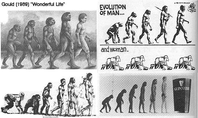
Regarding the classic evolution iconography (what most think is an a modern ape -> us transition), this has long been argued to be a very bad way to covey evolution to the average person. What people think of as apes today are just what they see at the zoo. But in science humans are apes. Us along with Bonobos, Orangutans, and others came from a common ancestor, an extinct ape unlike those in the zoo today, which in turn came from an extinct common ancestor among primate.
The graphics also incorrectly depicts evolution as a goal oriented process, such that a primate made progress to becoming an enlightened human. All of this is just wrong. I remember Stephen J. Gould talking about this in the book Wonderful Life. He labels this iconograph as the "icon of progress". Here is a picture from that book I believe showing how popular it become (making it's way into advertising):
There are better ways to graphically depict evolution. This essentially is probably the worst way to do so. For better ways read more here.
A more common way to represent evolution is phylogenetic trees such as these:


