First, go to the bookstore and get the book:
Don't Make Me Think, by Steve Krug (website usability book) - very useful for designing pleasing websites that people can and will use
(and no, despite the title, it does not draw you back to JWs)
Here's my observations (I'll be brutal, hope that's ok).
Here's a couple things I liked: Good color selection, nav menu (with the exception of no underlines for links) looks nice, good fonts/sizes.
Now, onto the critiques:
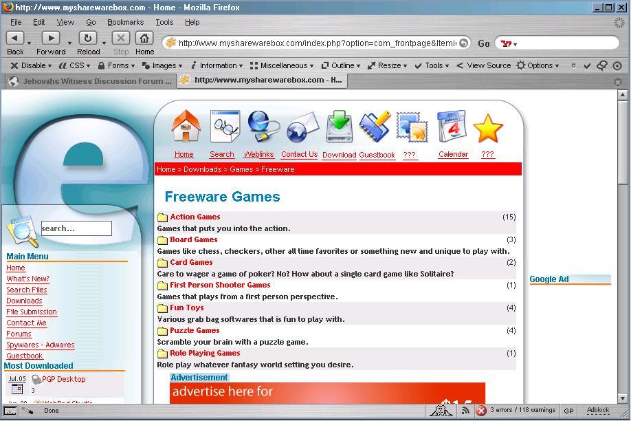
It wasn't clear to me what the site is about. There are too many things happening on the home page and I don't have a clear idea of what I'm supposed to do/click on/etc. (speaking of things to click on - it generally a good idea to leave the underlines for links instead of removing them like in the menu)
The icons across the top make no sense to me as far as what they mean - they either need a description word underneath or they need to go. Smaller icons would work especially with a word of description, I think. I assume that this is the main navigation for the site (along with the nav menu on the left)
The bread crumbs navagation right under the icons at the top should at least be left justified - in the center I thought the Home referred to the icon above it and it doesn't stand out at all. It should be on a colored background or something to set it apart.
Get rid of the advertisement at the top if at all possible - very tacky and you hate to give up prime real estate above the fold if you don't have to. Is that how the site plans to make money - by selling ads? If so, I would move it to either partway down the page or to the bottom, especially on the home page. If that isn't an option, just keep in mind that right now, that seems to be the most important element on the screen. If that is ok, then leave it as is, but if you want the rest of your site to stand out, it's apparant importance needs to be minimized. Also consider putting the Google ad on the right hand side in a third column instead of above the navigation if you can - that would be a big no-no.
Content section - why does the home page include a bunch of articles and links to news stories? That should go on a seperate Industry News page and leave your home page for a brief description of what people can expect to find and do at your site. That would go a long way to explaining what your site is about and if they are in the right place or not.
I hope this doesn't come across too harsh - the site looks good, just needs to be rearranged a bit and cleaned up, I think. Here's a really quick JPG I did for you to see what I was thinking - quality got shot up when saving to JPG of course - you can click it for the full size image - I made it a bit smaller for the forum:

