How can the charts be trusted if the data is getting manpulated? How can we say "go to peer reviewed journals" if there is an effort to not publish research papers that go against the agenda?
The problem extends past the East Anglia CRU, NOAA/GHCN "homogenization" falsified climate declines into increases:
http://wattsupwiththat.com/2009/12/08/the-smoking-gun-at-darwin-zero/
8 12 2009
by Willis Eschenbach
People keep saying “Yes, the Climategate scientists behaved badly. But that doesn’t mean the data is bad. That doesn’t mean the earth is not warming.”
Let me start with the second objection first. The earth has generally been warming since the Little Ice Age, around 1650. There is general agreement that the earth has warmed since then. See e.g. Akasofu . Climategate doesn’t affect that.
The second question, the integrity of the data, is different. People say “Yes, they destroyed emails, and hid from Freedom of information Acts, and messed with proxies, and fought to keep other scientists’ papers out of the journals … but that doesn’t affect the data, the data is still good.” Which sounds reasonable.
There are three main global temperature datasets. One is at the CRU, Climate Research Unit of the University of East Anglia, where we’ve been trying to get access to the raw numbers. One is at NOAA/GHCN, the Global Historical Climate Network. The final one is at NASA/GISS, the Goddard Institute for Space Studies. The three groups take raw data, and they “homogenize” it to remove things like when a station was moved to a warmer location and there’s a 2C jump in the temperature. The three global temperature records are usually called CRU, GISS, and GHCN. Both GISS and CRU, however, get almost all of their raw data from GHCN. All three produce very similar global historical temperature records from the raw data.
So I’m still on my multi-year quest to understand the climate data. You never know where this data chase will lead. This time, it has ended me up in Australia. I got to thinking about Professor Wibjorn Karlen’s statement about Australia that I quoted here:
Another example is Australia. NASA [GHCN] only presents 3 stations covering the period 1897-1992. What kind of data is the IPCC Australia diagram based on?
If any trend it is a slight cooling. However, if a shorter period (1949-2005) is used, the temperature has increased substantially. The Australians have many stations and have published more detailed maps of changes and trends.
The folks at CRU told Wibjorn that he was just plain wrong. Here’s what they said is right, the record that Wibjorn was talking about, Fig. 9.12 in the UN IPCC Fourth Assessment Report, showing Northern Australia:
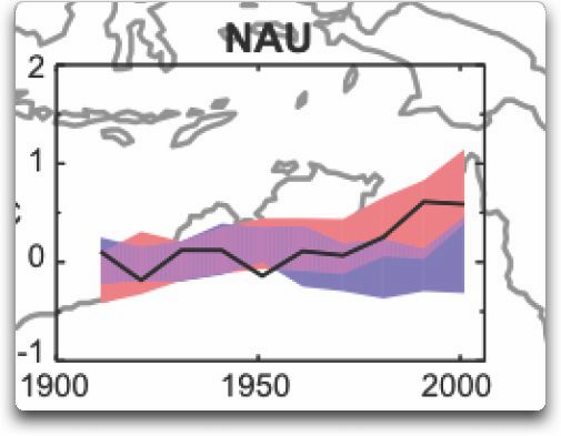
Figure 1. Temperature trends and model results in Northern Au
